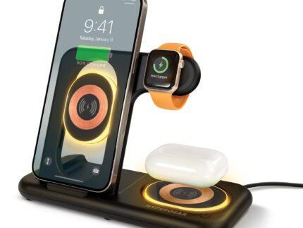
AeroFlex 360 Open-Ear True Wireless Earbuds | Black
.smk-content .sectionbigbannerssmk_big_banners_FWRxTr .blidsmk_big_banners_FWRxTr1 .smk-title-small {
font-size: 36px;
line-height: 70px;
font-weight: 300;
}
.smk-content .sectionbigbannerssmk_big_banners_FWRxTr .blidsmk_big_banners_FWRxTr1 .smk-title-large {
font-size: 70px;
line-height: 70px;
font-weight: 600;
}
.smk-content .sectionbigbannerssmk_big_banners_FWRxTr .blidsmk_big_banners_FWRxTr1 .smk-description-text {
font-size: 16px;
line-height: 22px;
font-weight: 300;
}
.smk-content .sectionbigbannerssmk_big_banners_FWRxTr .blidsmk_big_banners_FWRxTr1 .btn {
font-size: 13px;
padding: 10px calc(10px + 8px);
line-height: 1.5;
}
@media (max-width: 790px){
.smk-content .sectionbigbannerssmk_big_banners_FWRxTr .blidsmk_big_banners_FWRxTr1 .smk-title-small {
font-size: 14px;
line-height: 12px;
font-weight: 400;
}
.smk-content .sectionbigbannerssmk_big_banners_FWRxTr .blidsmk_big_banners_FWRxTr1 .smk-title-large {
font-size: 17px;
line-height: 20px;
font-weight: 600;
}
.smk-content .sectionbigbannerssmk_big_banners_FWRxTr .blidsmk_big_banners_FWRxTr1 .smk-description-text {
font-size: 12px;
line-height: 14px;
font-weight: 400;
}
.smk-content .sectionbigbannerssmk_big_banners_FWRxTr .blidsmk_big_banners_FWRxTr1 .btn {
margin-top: 12px;
font-size: 12px;
padding: 5px calc(5px + 8px);
}
}.sectionbigbannerssmk_big_banners_FWRxTr .blidsmk_big_banners_FWRxTr2 .btn:hover{
/**/
}.smk-content .sectionbigbannerssmk_big_banners_FWRxTr .blidsmk_big_banners_FWRxTr2 .smk-title-small {
font-size: 36px;
line-height: 70px;
font-weight: 300;
}
.smk-content .sectionbigbannerssmk_big_banners_FWRxTr .blidsmk_big_banners_FWRxTr2 .smk-title-large {
font-size: 70px;
line-height: 70px;
font-weight: 600;
}
.smk-content .sectionbigbannerssmk_big_banners_FWRxTr .blidsmk_big_banners_FWRxTr2 .smk-description-text {
font-size: 16px;
line-height: 22px;
font-weight: 300;
}
.smk-content .sectionbigbannerssmk_big_banners_FWRxTr .blidsmk_big_banners_FWRxTr2 .btn {
font-size: 13px;
padding: 10px calc(10px + 8px);
line-height: 1.5;
}
@media (max-width: 790px){
.smk-content .sectionbigbannerssmk_big_banners_FWRxTr .blidsmk_big_banners_FWRxTr2 .smk-title-small {
font-size: 14px;
line-height: 12px;
font-weight: 400;
}
.smk-content .sectionbigbannerssmk_big_banners_FWRxTr .blidsmk_big_banners_FWRxTr2 .smk-title-large {
font-size: 17px;
line-height: 20px;
font-weight: 600;
}
.smk-content .sectionbigbannerssmk_big_banners_FWRxTr .blidsmk_big_banners_FWRxTr2 .smk-description-text {
font-size: 12px;
line-height: 14px;
font-weight: 400;
}
.smk-content .sectionbigbannerssmk_big_banners_FWRxTr .blidsmk_big_banners_FWRxTr2 .btn {
margin-top: 12px;
font-size: 12px;
padding: 5px calc(5px + 8px);
}
}.sectionbigbannerssmk_big_banners_FWRxTr .blidsmk_big_banners_FWRxTr3 .btn:hover{
/**/
}.smk-content .sectionbigbannerssmk_big_banners_FWRxTr .blidsmk_big_banners_FWRxTr3 .smk-title-small {
font-size: 36px;
line-height: 70px;
font-weight: 300;
}
.smk-content .sectionbigbannerssmk_big_banners_FWRxTr .blidsmk_big_banners_FWRxTr3 .smk-title-large {
font-size: 70px;
line-height: 70px;
font-weight: 600;
}
.smk-content .sectionbigbannerssmk_big_banners_FWRxTr .blidsmk_big_banners_FWRxTr3 .smk-description-text {
font-size: 16px;
line-height: 22px;
font-weight: 300;
}
.smk-content .sectionbigbannerssmk_big_banners_FWRxTr .blidsmk_big_banners_FWRxTr3 .btn {
font-size: 13px;
padding: 10px calc(10px + 8px);
line-height: 1.5;
}
@media (max-width: 790px){
.smk-content .sectionbigbannerssmk_big_banners_FWRxTr .blidsmk_big_banners_FWRxTr3 .smk-title-small {
font-size: 14px;
line-height: 12px;
font-weight: 400;
}
.smk-content .sectionbigbannerssmk_big_banners_FWRxTr .blidsmk_big_banners_FWRxTr3 .smk-title-large {
font-size: 17px;
line-height: 20px;
font-weight: 600;
}
.smk-content .sectionbigbannerssmk_big_banners_FWRxTr .blidsmk_big_banners_FWRxTr3 .smk-description-text {
font-size: 12px;
line-height: 14px;
font-weight: 400;
}
.smk-content .sectionbigbannerssmk_big_banners_FWRxTr .blidsmk_big_banners_FWRxTr3 .btn {
margin-top: 12px;
font-size: 12px;
padding: 5px calc(5px + 8px);
}
}
Feels Like Air
.tpisectionsmk_text_plus_image_eFmVVi .smk-layout-box01 .col-img {
display: flex !important;
justify-content: center;
}
.tpisectionsmk_text_plus_image_eFmVVi .smk-layout-box01 .col-img img {
align-self: center;
height: auto;
}
.tpisectionsmk_text_plus_image_eFmVVi .smk-layout-box01 .col-description{
font-weight: 300;
color: #777777;
}
.tpisectionsmk_text_plus_image_eFmVVi .smk-layout-box01 .col-description .smk-title{
font-weight: 700;
color: #191919;
}
@media (min-width: 1025px){
.tpisectionsmk_text_plus_image_eFmVVi .smk-layout-box01 .col-description{
font-size: 22px;
line-height: 30px;
}
.tpisectionsmk_text_plus_image_eFmVVi .smk-layout-box01 .col-description .smk-title{
font-size: 34px;
line-height: 42px;
padding: 0 0 16px 0;
}
}
@media (max-width: 1024px){
.tpisectionsmk_text_plus_image_eFmVVi .smk-layout-box01 .col-description{
font-size: 16px;
line-height: 24px;
font-weight: 400;
}
.tpisectionsmk_text_plus_image_eFmVVi .smk-layout-box01 .col-description .smk-title{
font-size: 20px;
line-height: 28px;
padding-bottom: 10px;
font-weight: 700;
}
}
.tpisectionsmk_text_plus_image_eFmVVi .layout-box01-wrapper{
background-color: #ffffff;
background-repeat: no-repeat;
background-size: cover;
background-position: center;
}
.tpisectionsmk_text_plus_image_eFmVVi .smk-layout-box01:not(.flex-row-reverse) .col-description{
padding-left: 60px;
}
.tpisectionsmk_text_plus_image_eFmVVi .smk-layout-box01.flex-row-reverse .col-description:last-child{
padding-right: 60px;
}
.tpisectionsmk_text_plus_image_eFmVVi .smk-layout-box01 .col-description .btn{
background:#191919;
color:#ffffff;
display: block;
width: fit-content;
}
.tpisectionsmk_text_plus_image_eFmVVi .smk-layout-box01 .col-description .btn:hover{
background: #ffffff;
color: #191919;
}
@media (min-width: 1025px){
.tpisectionsmk_text_plus_image_eFmVVi .smk-layout-box01 .col-description .btn-section-css{
margin-top: 16px;
}
.tpisectionsmk_text_plus_image_eFmVVi .layout-box01-wrapper{
padding-top: 80px;
padding-bottom: 80px;
}
}
@media (max-width: 1024px){
.tpisectionsmk_text_plus_image_eFmVVi .smk-layout-box01.row-reverse-mobile {
flex-direction: column-reverse !important;
}
.tpisectionsmk_text_plus_image_eFmVVi .smk-layout-box01 .col-description .btn-section-css{
margin-top: 20px;
}
.tpisectionsmk_text_plus_image_eFmVVi .layout-box01-wrapper{
padding-top: 40px;
padding-bottom: 40px;
}
}
.tpisectionsmk_text_plus_image_eFmVVi .smk-layout-box01 a.hover-underline{
font-size: 18px;
line-height: 18px;
font-weight: 400;
color: #ffffff;
-webkit-transition: color .2s ease-out;
transition: color .2s ease-out;
}
.tpisectionsmk_text_plus_image_eFmVVi .smk-layout-box01 a.hover-underline:before{
background: #ffffff;
bottom: -1px;
}
.tpisectionsmk_text_plus_image_eFmVVi .smk-layout-box01 a.hover-underline.underlinebydefault:before{
width: 100%;
background: #191919;
-webkit-transition: all .3s ease-out;
transition: all .3s ease-out;
}
.tpisectionsmk_text_plus_image_eFmVVi .smk-layout-box01 a.hover-underline:hover{
color: #191919;
}
.tpisectionsmk_text_plus_image_eFmVVi .smk-layout-box01 a.hover-underline.underlinebydefault:hover:before{
width: 0%;
background: #ffffff;
}
.tpisectionsmk_text_plus_image_eFmVVi .smk-layout-box01 .col-description .btn:hover{
}
Never Miss a Beat
.tpisectionsmk_text_plus_image_JUWX8T .smk-layout-box01 .col-img {
display: flex !important;
justify-content: center;
}
.tpisectionsmk_text_plus_image_JUWX8T .smk-layout-box01 .col-img img {
align-self: center;
height: auto;
}
.tpisectionsmk_text_plus_image_JUWX8T .smk-layout-box01 .col-description{
font-weight: 300;
color: #777777;
}
.tpisectionsmk_text_plus_image_JUWX8T .smk-layout-box01 .col-description .smk-title{
font-weight: 700;
color: #191919;
}
@media (min-width: 1025px){
.tpisectionsmk_text_plus_image_JUWX8T .smk-layout-box01 .col-description{
font-size: 22px;
line-height: 30px;
}
.tpisectionsmk_text_plus_image_JUWX8T .smk-layout-box01 .col-description .smk-title{
font-size: 34px;
line-height: 42px;
padding: 0 0 16px 0;
}
}
@media (max-width: 1024px){
.tpisectionsmk_text_plus_image_JUWX8T .smk-layout-box01 .col-description{
font-size: 16px;
line-height: 24px;
font-weight: 400;
}
.tpisectionsmk_text_plus_image_JUWX8T .smk-layout-box01 .col-description .smk-title{
font-size: 20px;
line-height: 28px;
padding-bottom: 10px;
font-weight: 700;
}
}
.tpisectionsmk_text_plus_image_JUWX8T .layout-box01-wrapper{
background-color: #f2f2f2;
background-repeat: no-repeat;
background-size: cover;
background-position: center;
}
.tpisectionsmk_text_plus_image_JUWX8T .smk-layout-box01:not(.flex-row-reverse) .col-description{
padding-left: 60px;
}
.tpisectionsmk_text_plus_image_JUWX8T .smk-layout-box01.flex-row-reverse .col-description:last-child{
padding-right: 60px;
}
.tpisectionsmk_text_plus_image_JUWX8T .smk-layout-box01 .col-description .btn{
background:#191919;
color:#ffffff;
display: block;
width: fit-content;
}
.tpisectionsmk_text_plus_image_JUWX8T .smk-layout-box01 .col-description .btn:hover{
background: #ffffff;
color: #191919;
}
@media (min-width: 1025px){
.tpisectionsmk_text_plus_image_JUWX8T .smk-layout-box01 .col-description .btn-section-css{
margin-top: 16px;
}
.tpisectionsmk_text_plus_image_JUWX8T .layout-box01-wrapper{
padding-top: 80px;
padding-bottom: 80px;
}
}
@media (max-width: 1024px){
.tpisectionsmk_text_plus_image_JUWX8T .smk-layout-box01.row-reverse-mobile {
flex-direction: column-reverse !important;
}
.tpisectionsmk_text_plus_image_JUWX8T .smk-layout-box01 .col-description .btn-section-css{
margin-top: 20px;
}
.tpisectionsmk_text_plus_image_JUWX8T .layout-box01-wrapper{
padding-top: 0px;
padding-bottom: 40px;
}
}
.tpisectionsmk_text_plus_image_JUWX8T .smk-layout-box01 a.hover-underline{
font-size: 18px;
line-height: 18px;
font-weight: 400;
color: #ffffff;
-webkit-transition: color .2s ease-out;
transition: color .2s ease-out;
}
.tpisectionsmk_text_plus_image_JUWX8T .smk-layout-box01 a.hover-underline:before{
background: #ffffff;
bottom: -1px;
}
.tpisectionsmk_text_plus_image_JUWX8T .smk-layout-box01 a.hover-underline.underlinebydefault:before{
width: 100%;
background: #191919;
-webkit-transition: all .3s ease-out;
transition: all .3s ease-out;
}
.tpisectionsmk_text_plus_image_JUWX8T .smk-layout-box01 a.hover-underline:hover{
color: #191919;
}
.tpisectionsmk_text_plus_image_JUWX8T .smk-layout-box01 a.hover-underline.underlinebydefault:hover:before{
width: 0%;
background: #ffffff;
}
.tpisectionsmk_text_plus_image_JUWX8T .smk-layout-box01 .col-description .btn:hover{
}
Directional Acoustic Technology
.tpisectionsmk_text_plus_image_KidJ9W .smk-layout-box01 .col-img {
display: flex !important;
justify-content: center;
}
.tpisectionsmk_text_plus_image_KidJ9W .smk-layout-box01 .col-img img {
align-self: center;
height: auto;
}
.tpisectionsmk_text_plus_image_KidJ9W .smk-layout-box01 .col-description{
font-weight: 300;
color: #777777;
}
.tpisectionsmk_text_plus_image_KidJ9W .smk-layout-box01 .col-description .smk-title{
font-weight: 700;
color: #191919;
}
@media (min-width: 1025px){
.tpisectionsmk_text_plus_image_KidJ9W .smk-layout-box01 .col-description{
font-size: 22px;
line-height: 30px;
}
.tpisectionsmk_text_plus_image_KidJ9W .smk-layout-box01 .col-description .smk-title{
font-size: 34px;
line-height: 42px;
padding: 0 0 16px 0;
}
}
@media (max-width: 1024px){
.tpisectionsmk_text_plus_image_KidJ9W .smk-layout-box01 .col-description{
font-size: 16px;
line-height: 24px;
font-weight: 400;
}
.tpisectionsmk_text_plus_image_KidJ9W .smk-layout-box01 .col-description .smk-title{
font-size: 20px;
line-height: 28px;
padding-bottom: 10px;
font-weight: 700;
}
}
.tpisectionsmk_text_plus_image_KidJ9W .layout-box01-wrapper{
background-color: #ffffff;
background-repeat: no-repeat;
background-size: cover;
background-position: center;
}
.tpisectionsmk_text_plus_image_KidJ9W .smk-layout-box01:not(.flex-row-reverse) .col-description{
padding-left: 60px;
}
.tpisectionsmk_text_plus_image_KidJ9W .smk-layout-box01.flex-row-reverse .col-description:last-child{
padding-right: 60px;
}
.tpisectionsmk_text_plus_image_KidJ9W .smk-layout-box01 .col-description .btn{
background:#191919;
color:#ffffff;
display: block;
width: fit-content;
}
.tpisectionsmk_text_plus_image_KidJ9W .smk-layout-box01 .col-description .btn:hover{
background: #ffffff;
color: #191919;
}
@media (min-width: 1025px){
.tpisectionsmk_text_plus_image_KidJ9W .smk-layout-box01 .col-description .btn-section-css{
margin-top: 16px;
}
.tpisectionsmk_text_plus_image_KidJ9W .layout-box01-wrapper{
padding-top: 80px;
padding-bottom: 80px;
}
}
@media (max-width: 1024px){
.tpisectionsmk_text_plus_image_KidJ9W .smk-layout-box01.row-reverse-mobile {
flex-direction: column-reverse !important;
}
.tpisectionsmk_text_plus_image_KidJ9W .smk-layout-box01 .col-description .btn-section-css{
margin-top: 20px;
}
.tpisectionsmk_text_plus_image_KidJ9W .layout-box01-wrapper{
padding-top: 40px;
padding-bottom: 40px;
}
}
.tpisectionsmk_text_plus_image_KidJ9W .smk-layout-box01 a.hover-underline{
font-size: 18px;
line-height: 18px;
font-weight: 400;
color: #ffffff;
-webkit-transition: color .2s ease-out;
transition: color .2s ease-out;
}
.tpisectionsmk_text_plus_image_KidJ9W .smk-layout-box01 a.hover-underline:before{
background: #ffffff;
bottom: -1px;
}
.tpisectionsmk_text_plus_image_KidJ9W .smk-layout-box01 a.hover-underline.underlinebydefault:before{
width: 100%;
background: #191919;
-webkit-transition: all .3s ease-out;
transition: all .3s ease-out;
}
.tpisectionsmk_text_plus_image_KidJ9W .smk-layout-box01 a.hover-underline:hover{
color: #191919;
}
.tpisectionsmk_text_plus_image_KidJ9W .smk-layout-box01 a.hover-underline.underlinebydefault:hover:before{
width: 0%;
background: #ffffff;
}
.tpisectionsmk_text_plus_image_KidJ9W .smk-layout-box01 .col-description .btn:hover{
}
Ultra-Light and Secure
.tpisectionsmk_text_plus_image_X8cWkP .smk-layout-box01 .col-img {
display: flex !important;
justify-content: center;
}
.tpisectionsmk_text_plus_image_X8cWkP .smk-layout-box01 .col-img img {
align-self: center;
height: auto;
}
.tpisectionsmk_text_plus_image_X8cWkP .smk-layout-box01 .col-description{
font-weight: 300;
color: #777777;
}
.tpisectionsmk_text_plus_image_X8cWkP .smk-layout-box01 .col-description .smk-title{
font-weight: 700;
color: #191919;
}
@media (min-width: 1025px){
.tpisectionsmk_text_plus_image_X8cWkP .smk-layout-box01 .col-description{
font-size: 22px;
line-height: 30px;
}
.tpisectionsmk_text_plus_image_X8cWkP .smk-layout-box01 .col-description .smk-title{
font-size: 34px;
line-height: 42px;
padding: 0 0 16px 0;
}
}
@media (max-width: 1024px){
.tpisectionsmk_text_plus_image_X8cWkP .smk-layout-box01 .col-description{
font-size: 16px;
line-height: 24px;
font-weight: 400;
}
.tpisectionsmk_text_plus_image_X8cWkP .smk-layout-box01 .col-description .smk-title{
font-size: 20px;
line-height: 28px;
padding-bottom: 10px;
font-weight: 700;
}
}
.tpisectionsmk_text_plus_image_X8cWkP .layout-box01-wrapper{
background-color: #f2f2f2;
background-repeat: no-repeat;
background-size: cover;
background-position: center;
}
.tpisectionsmk_text_plus_image_X8cWkP .smk-layout-box01:not(.flex-row-reverse) .col-description{
padding-left: 60px;
}
.tpisectionsmk_text_plus_image_X8cWkP .smk-layout-box01.flex-row-reverse .col-description:last-child{
padding-right: 60px;
}
.tpisectionsmk_text_plus_image_X8cWkP .smk-layout-box01 .col-description .btn{
background:#191919;
color:#ffffff;
display: block;
width: fit-content;
}
.tpisectionsmk_text_plus_image_X8cWkP .smk-layout-box01 .col-description .btn:hover{
background: #ffffff;
color: #191919;
}
@media (min-width: 1025px){
.tpisectionsmk_text_plus_image_X8cWkP .smk-layout-box01 .col-description .btn-section-css{
margin-top: 16px;
}
.tpisectionsmk_text_plus_image_X8cWkP .layout-box01-wrapper{
padding-top: 80px;
padding-bottom: 80px;
}
}
@media (max-width: 1024px){
.tpisectionsmk_text_plus_image_X8cWkP .smk-layout-box01.row-reverse-mobile {
flex-direction: column-reverse !important;
}
.tpisectionsmk_text_plus_image_X8cWkP .smk-layout-box01 .col-description .btn-section-css{
margin-top: 20px;
}
.tpisectionsmk_text_plus_image_X8cWkP .layout-box01-wrapper{
padding-top: 0px;
padding-bottom: 40px;
}
}
.tpisectionsmk_text_plus_image_X8cWkP .smk-layout-box01 a.hover-underline{
font-size: 18px;
line-height: 18px;
font-weight: 400;
color: #ffffff;
-webkit-transition: color .2s ease-out;
transition: color .2s ease-out;
}
.tpisectionsmk_text_plus_image_X8cWkP .smk-layout-box01 a.hover-underline:before{
background: #ffffff;
bottom: -1px;
}
.tpisectionsmk_text_plus_image_X8cWkP .smk-layout-box01 a.hover-underline.underlinebydefault:before{
width: 100%;
background: #191919;
-webkit-transition: all .3s ease-out;
transition: all .3s ease-out;
}
.tpisectionsmk_text_plus_image_X8cWkP .smk-layout-box01 a.hover-underline:hover{
color: #191919;
}
.tpisectionsmk_text_plus_image_X8cWkP .smk-layout-box01 a.hover-underline.underlinebydefault:hover:before{
width: 0%;
background: #ffffff;
}
.tpisectionsmk_text_plus_image_X8cWkP .smk-layout-box01 .col-description .btn:hover{
}
IPX4 Sweatproof and Rain-Ready
.tpisectionsmk_text_plus_image_6WYbhK .smk-layout-box01 .col-img {
display: flex !important;
justify-content: center;
}
.tpisectionsmk_text_plus_image_6WYbhK .smk-layout-box01 .col-img img {
align-self: center;
height: auto;
}
.tpisectionsmk_text_plus_image_6WYbhK .smk-layout-box01 .col-description{
font-weight: 300;
color: #777777;
}
.tpisectionsmk_text_plus_image_6WYbhK .smk-layout-box01 .col-description .smk-title{
font-weight: 700;
color: #191919;
}
@media (min-width: 1025px){
.tpisectionsmk_text_plus_image_6WYbhK .smk-layout-box01 .col-description{
font-size: 22px;
line-height: 30px;
}
.tpisectionsmk_text_plus_image_6WYbhK .smk-layout-box01 .col-description .smk-title{
font-size: 34px;
line-height: 42px;
padding: 0 0 16px 0;
}
}
@media (max-width: 1024px){
.tpisectionsmk_text_plus_image_6WYbhK .smk-layout-box01 .col-description{
font-size: 16px;
line-height: 24px;
font-weight: 400;
}
.tpisectionsmk_text_plus_image_6WYbhK .smk-layout-box01 .col-description .smk-title{
font-size: 20px;
line-height: 28px;
padding-bottom: 10px;
font-weight: 700;
}
}
.tpisectionsmk_text_plus_image_6WYbhK .layout-box01-wrapper{
background-color: #ffffff;
background-repeat: no-repeat;
background-size: cover;
background-position: center;
}
.tpisectionsmk_text_plus_image_6WYbhK .smk-layout-box01:not(.flex-row-reverse) .col-description{
padding-left: 60px;
}
.tpisectionsmk_text_plus_image_6WYbhK .smk-layout-box01.flex-row-reverse .col-description:last-child{
padding-right: 60px;
}
.tpisectionsmk_text_plus_image_6WYbhK .smk-layout-box01 .col-description .btn{
background:#191919;
color:#ffffff;
display: block;
width: fit-content;
}
.tpisectionsmk_text_plus_image_6WYbhK .smk-layout-box01 .col-description .btn:hover{
background: #ffffff;
color: #191919;
}
@media (min-width: 1025px){
.tpisectionsmk_text_plus_image_6WYbhK .smk-layout-box01 .col-description .btn-section-css{
margin-top: 16px;
}
.tpisectionsmk_text_plus_image_6WYbhK .layout-box01-wrapper{
padding-top: 80px;
padding-bottom: 80px;
}
}
@media (max-width: 1024px){
.tpisectionsmk_text_plus_image_6WYbhK .smk-layout-box01.row-reverse-mobile {
flex-direction: column-reverse !important;
}
.tpisectionsmk_text_plus_image_6WYbhK .smk-layout-box01 .col-description .btn-section-css{
margin-top: 20px;
}
.tpisectionsmk_text_plus_image_6WYbhK .layout-box01-wrapper{
padding-top: 40px;
padding-bottom: 40px;
}
}
.tpisectionsmk_text_plus_image_6WYbhK .smk-layout-box01 a.hover-underline{
font-size: 18px;
line-height: 18px;
font-weight: 400;
color: #ffffff;
-webkit-transition: color .2s ease-out;
transition: color .2s ease-out;
}
.tpisectionsmk_text_plus_image_6WYbhK .smk-layout-box01 a.hover-underline:before{
background: #ffffff;
bottom: -1px;
}
.tpisectionsmk_text_plus_image_6WYbhK .smk-layout-box01 a.hover-underline.underlinebydefault:before{
width: 100%;
background: #191919;
-webkit-transition: all .3s ease-out;
transition: all .3s ease-out;
}
.tpisectionsmk_text_plus_image_6WYbhK .smk-layout-box01 a.hover-underline:hover{
color: #191919;
}
.tpisectionsmk_text_plus_image_6WYbhK .smk-layout-box01 a.hover-underline.underlinebydefault:hover:before{
width: 0%;
background: #ffffff;
}
.tpisectionsmk_text_plus_image_6WYbhK .smk-layout-box01 .col-description .btn:hover{
}
Enhanced Call Quality
.tpisectionsmk_text_plus_image_BicCNd .smk-layout-box01 .col-img {
display: flex !important;
justify-content: center;
}
.tpisectionsmk_text_plus_image_BicCNd .smk-layout-box01 .col-img img {
align-self: center;
height: auto;
}
.tpisectionsmk_text_plus_image_BicCNd .smk-layout-box01 .col-description{
font-weight: 300;
color: #777777;
}
.tpisectionsmk_text_plus_image_BicCNd .smk-layout-box01 .col-description .smk-title{
font-weight: 700;
color: #191919;
}
@media (min-width: 1025px){
.tpisectionsmk_text_plus_image_BicCNd .smk-layout-box01 .col-description{
font-size: 22px;
line-height: 30px;
}
.tpisectionsmk_text_plus_image_BicCNd .smk-layout-box01 .col-description .smk-title{
font-size: 34px;
line-height: 42px;
padding: 0 0 16px 0;
}
}
@media (max-width: 1024px){
.tpisectionsmk_text_plus_image_BicCNd .smk-layout-box01 .col-description{
font-size: 16px;
line-height: 24px;
font-weight: 400;
}
.tpisectionsmk_text_plus_image_BicCNd .smk-layout-box01 .col-description .smk-title{
font-size: 20px;
line-height: 28px;
padding-bottom: 10px;
font-weight: 700;
}
}
.tpisectionsmk_text_plus_image_BicCNd .layout-box01-wrapper{
background-color: #f2f2f2;
background-repeat: no-repeat;
background-size: cover;
background-position: center;
}
.tpisectionsmk_text_plus_image_BicCNd .smk-layout-box01:not(.flex-row-reverse) .col-description{
padding-left: 60px;
}
.tpisectionsmk_text_plus_image_BicCNd .smk-layout-box01.flex-row-reverse .col-description:last-child{
padding-right: 60px;
}
.tpisectionsmk_text_plus_image_BicCNd .smk-layout-box01 .col-description .btn{
background:#191919;
color:#ffffff;
display: block;
width: fit-content;
}
.tpisectionsmk_text_plus_image_BicCNd .smk-layout-box01 .col-description .btn:hover{
background: #ffffff;
color: #191919;
}
@media (min-width: 1025px){
.tpisectionsmk_text_plus_image_BicCNd .smk-layout-box01 .col-description .btn-section-css{
margin-top: 16px;
}
.tpisectionsmk_text_plus_image_BicCNd .layout-box01-wrapper{
padding-top: 80px;
padding-bottom: 80px;
}
}
@media (max-width: 1024px){
.tpisectionsmk_text_plus_image_BicCNd .smk-layout-box01.row-reverse-mobile {
flex-direction: column-reverse !important;
}
.tpisectionsmk_text_plus_image_BicCNd .smk-layout-box01 .col-description .btn-section-css{
margin-top: 20px;
}
.tpisectionsmk_text_plus_image_BicCNd .layout-box01-wrapper{
padding-top: 0px;
padding-bottom: 40px;
}
}
.tpisectionsmk_text_plus_image_BicCNd .smk-layout-box01 a.hover-underline{
font-size: 18px;
line-height: 18px;
font-weight: 400;
color: #ffffff;
-webkit-transition: color .2s ease-out;
transition: color .2s ease-out;
}
.tpisectionsmk_text_plus_image_BicCNd .smk-layout-box01 a.hover-underline:before{
background: #ffffff;
bottom: -1px;
}
.tpisectionsmk_text_plus_image_BicCNd .smk-layout-box01 a.hover-underline.underlinebydefault:before{
width: 100%;
background: #191919;
-webkit-transition: all .3s ease-out;
transition: all .3s ease-out;
}
.tpisectionsmk_text_plus_image_BicCNd .smk-layout-box01 a.hover-underline:hover{
color: #191919;
}
.tpisectionsmk_text_plus_image_BicCNd .smk-layout-box01 a.hover-underline.underlinebydefault:hover:before{
width: 0%;
background: #ffffff;
}
.tpisectionsmk_text_plus_image_BicCNd .smk-layout-box01 .col-description .btn:hover{
}
Excellent Battery Life
The pocket-portable charging case holds up to 18 hours of additional playtime and features a digital battery display – so you’ll never be caught off guard by a dead battery.
.tpisectionsmk_text_plus_image_E8RDcD .smk-layout-box01 .col-img {
display: flex !important;
justify-content: center;
}
.tpisectionsmk_text_plus_image_E8RDcD .smk-layout-box01 .col-img img {
align-self: center;
height: auto;
}
.tpisectionsmk_text_plus_image_E8RDcD .smk-layout-box01 .col-description{
font-weight: 300;
color: #777777;
}
.tpisectionsmk_text_plus_image_E8RDcD .smk-layout-box01 .col-description .smk-title{
font-weight: 700;
color: #191919;
}
@media (min-width: 1025px){
.tpisectionsmk_text_plus_image_E8RDcD .smk-layout-box01 .col-description{
font-size: 22px;
line-height: 30px;
}
.tpisectionsmk_text_plus_image_E8RDcD .smk-layout-box01 .col-description .smk-title{
font-size: 34px;
line-height: 42px;
padding: 0 0 16px 0;
}
}
@media (max-width: 1024px){
.tpisectionsmk_text_plus_image_E8RDcD .smk-layout-box01 .col-description{
font-size: 16px;
line-height: 24px;
font-weight: 400;
}
.tpisectionsmk_text_plus_image_E8RDcD .smk-layout-box01 .col-description .smk-title{
font-size: 20px;
line-height: 28px;
padding-bottom: 10px;
font-weight: 700;
}
}
.tpisectionsmk_text_plus_image_E8RDcD .layout-box01-wrapper{
background-color: #ffffff;
background-repeat: no-repeat;
background-size: cover;
background-position: center;
}
.tpisectionsmk_text_plus_image_E8RDcD .smk-layout-box01:not(.flex-row-reverse) .col-description{
padding-left: 60px;
}
.tpisectionsmk_text_plus_image_E8RDcD .smk-layout-box01.flex-row-reverse .col-description:last-child{
padding-right: 60px;
}
.tpisectionsmk_text_plus_image_E8RDcD .smk-layout-box01 .col-description .btn{
background:#191919;
color:#ffffff;
display: block;
width: fit-content;
}
.tpisectionsmk_text_plus_image_E8RDcD .smk-layout-box01 .col-description .btn:hover{
background: #ffffff;
color: #191919;
}
@media (min-width: 1025px){
.tpisectionsmk_text_plus_image_E8RDcD .smk-layout-box01 .col-description .btn-section-css{
margin-top: 16px;
}
.tpisectionsmk_text_plus_image_E8RDcD .layout-box01-wrapper{
padding-top: 80px;
padding-bottom: 80px;
}
}
@media (max-width: 1024px){
.tpisectionsmk_text_plus_image_E8RDcD .smk-layout-box01.row-reverse-mobile {
flex-direction: column-reverse !important;
}
.tpisectionsmk_text_plus_image_E8RDcD .smk-layout-box01 .col-description .btn-section-css{
margin-top: 20px;
}
.tpisectionsmk_text_plus_image_E8RDcD .layout-box01-wrapper{
padding-top: 40px;
padding-bottom: 40px;
}
}
.tpisectionsmk_text_plus_image_E8RDcD .smk-layout-box01 a.hover-underline{
font-size: 18px;
line-height: 18px;
font-weight: 400;
color: #ffffff;
-webkit-transition: color .2s ease-out;
transition: color .2s ease-out;
}
.tpisectionsmk_text_plus_image_E8RDcD .smk-layout-box01 a.hover-underline:before{
background: #ffffff;
bottom: -1px;
}
.tpisectionsmk_text_plus_image_E8RDcD .smk-layout-box01 a.hover-underline.underlinebydefault:before{
width: 100%;
background: #191919;
-webkit-transition: all .3s ease-out;
transition: all .3s ease-out;
}
.tpisectionsmk_text_plus_image_E8RDcD .smk-layout-box01 a.hover-underline:hover{
color: #191919;
}
.tpisectionsmk_text_plus_image_E8RDcD .smk-layout-box01 a.hover-underline.underlinebydefault:hover:before{
width: 0%;
background: #ffffff;
}
.tpisectionsmk_text_plus_image_E8RDcD .smk-layout-box01 .col-description .btn:hover{
}
Rock-Solid Connection
.tpisectionsmk_text_plus_image_aJQYyU .smk-layout-box01 .col-img {
display: flex !important;
justify-content: center;
}
.tpisectionsmk_text_plus_image_aJQYyU .smk-layout-box01 .col-img img {
align-self: center;
height: auto;
}
.tpisectionsmk_text_plus_image_aJQYyU .smk-layout-box01 .col-description{
font-weight: 300;
color: #777777;
}
.tpisectionsmk_text_plus_image_aJQYyU .smk-layout-box01 .col-description .smk-title{
font-weight: 700;
color: #191919;
}
@media (min-width: 1025px){
.tpisectionsmk_text_plus_image_aJQYyU .smk-layout-box01 .col-description{
font-size: 22px;
line-height: 30px;
}
.tpisectionsmk_text_plus_image_aJQYyU .smk-layout-box01 .col-description .smk-title{
font-size: 34px;
line-height: 42px;
padding: 0 0 16px 0;
}
}
@media (max-width: 1024px){
.tpisectionsmk_text_plus_image_aJQYyU .smk-layout-box01 .col-description{
font-size: 16px;
line-height: 24px;
font-weight: 400;
}
.tpisectionsmk_text_plus_image_aJQYyU .smk-layout-box01 .col-description .smk-title{
font-size: 20px;
line-height: 28px;
padding-bottom: 10px;
font-weight: 700;
}
}
.tpisectionsmk_text_plus_image_aJQYyU .layout-box01-wrapper{
background-color: #f2f2f2;
background-repeat: no-repeat;
background-size: cover;
background-position: center;
}
.tpisectionsmk_text_plus_image_aJQYyU .smk-layout-box01:not(.flex-row-reverse) .col-description{
padding-left: 60px;
}
.tpisectionsmk_text_plus_image_aJQYyU .smk-layout-box01.flex-row-reverse .col-description:last-child{
padding-right: 60px;
}
.tpisectionsmk_text_plus_image_aJQYyU .smk-layout-box01 .col-description .btn{
background:#191919;
color:#ffffff;
display: block;
width: fit-content;
}
.tpisectionsmk_text_plus_image_aJQYyU .smk-layout-box01 .col-description .btn:hover{
background: #ffffff;
color: #191919;
}
@media (min-width: 1025px){
.tpisectionsmk_text_plus_image_aJQYyU .smk-layout-box01 .col-description .btn-section-css{
margin-top: 16px;
}
.tpisectionsmk_text_plus_image_aJQYyU .layout-box01-wrapper{
padding-top: 80px;
padding-bottom: 80px;
}
}
@media (max-width: 1024px){
.tpisectionsmk_text_plus_image_aJQYyU .smk-layout-box01.row-reverse-mobile {
flex-direction: column-reverse !important;
}
.tpisectionsmk_text_plus_image_aJQYyU .smk-layout-box01 .col-description .btn-section-css{
margin-top: 20px;
}
.tpisectionsmk_text_plus_image_aJQYyU .layout-box01-wrapper{
padding-top: 0px;
padding-bottom: 40px;
}
}
.tpisectionsmk_text_plus_image_aJQYyU .smk-layout-box01 a.hover-underline{
font-size: 18px;
line-height: 18px;
font-weight: 400;
color: #ffffff;
-webkit-transition: color .2s ease-out;
transition: color .2s ease-out;
}
.tpisectionsmk_text_plus_image_aJQYyU .smk-layout-box01 a.hover-underline:before{
background: #ffffff;
bottom: -1px;
}
.tpisectionsmk_text_plus_image_aJQYyU .smk-layout-box01 a.hover-underline.underlinebydefault:before{
width: 100%;
background: #191919;
-webkit-transition: all .3s ease-out;
transition: all .3s ease-out;
}
.tpisectionsmk_text_plus_image_aJQYyU .smk-layout-box01 a.hover-underline:hover{
color: #191919;
}
.tpisectionsmk_text_plus_image_aJQYyU .smk-layout-box01 a.hover-underline.underlinebydefault:hover:before{
width: 0%;
background: #ffffff;
}
.tpisectionsmk_text_plus_image_aJQYyU .smk-layout-box01 .col-description .btn:hover{
}